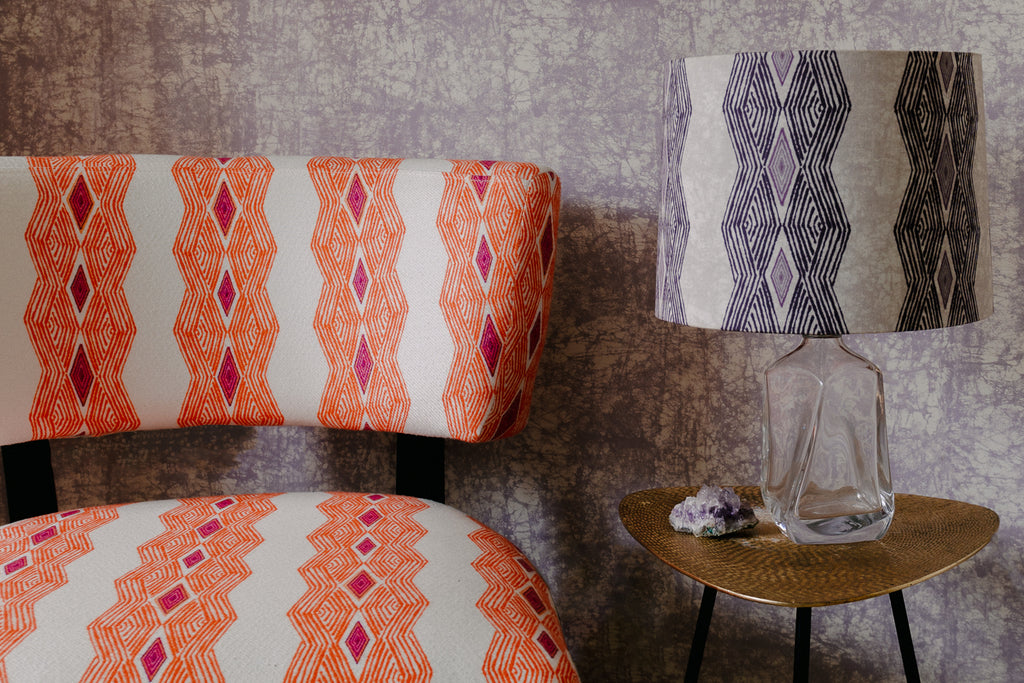
Our motto here at Eva Sonaike is ‘Bringing Colour to Life’ and after over a decade in business, I am still on a mission to enhance people’s homes and lives with colour.
People often ask me, why adding colour to your life is so important to and why I made it my mission to infuse the world with colour, pattern and African interiors?
It has been scientifically proven that colour can dramatically affect moods, feelings, and emotions, and plays a vitally important role in the world in which we live in.

Colour can have an impact on how we are thinking, act and react. It can irritate or soothe your eyes, raise your blood pressure and even suppress your appetite.
In Interior design, colour can make or break a space. Depending in the colour palette, every room in a house can evoke a mood or an atmosphere.
Warm tones, like red, orange and yellow can are associated with passion and can energize a space and its occupants, whereas cool tones such as blue, green and purple are considered calming and serene and generally create quiet, relaxing atmospheres.

For example, pairing cool hues like blues and greens together always works well.
Or pairing a mix of warm neutrals, such as a soft beige with a rich brown or a deep shade of orange, will be equally pleasing to the eye.
There is a theory when it comes to colour and earlier in our welcome series (Pantone’s Aragon and how to use it in interiors), we elaborated on the art of colour pairing in interior design. Here is a little refresher:
Monochromatic colour schemes are derived from a single base hue and are extended using its shades, tones and tints.

An analogous colour scheme is composed of two or more harmonious colours closely related that lie next to each other on the colour wheel and therefore have similar hues.
Split-complementary is a colour scheme using one base colour and two secondary colours. Instead of using a complementary colour, two colours placed around it on the colour wheel are used.

A triadic colour scheme uses colours that are evenly spaced around the colour wheel. Triadic colour harmonies tend to be quite vibrant, even if you use pale or unsaturated versions of your hues.

Complementary colours are the two hues across from one another on the colour wheel, like red and green, blue and orange or purple and yellow. When mixed they will effectively cancel one another out, creating a muddy brown or black hue.

This might all sound a little bit confusing, I know, but don’t give up on your colour journey! One of the most important aspects of decorating with colour is to create the right mood for you; a space where you can be comfortable, relaxed and at ease.
Start with choosing a colour you love and that makes you happy and experiment with it.

And if in doubt, there is always help at hand. You can book your free colour consultation with us here at Eva Sonaike, where we analyse your needs and help you choose some items that bring colour to your life.


Leave a comment